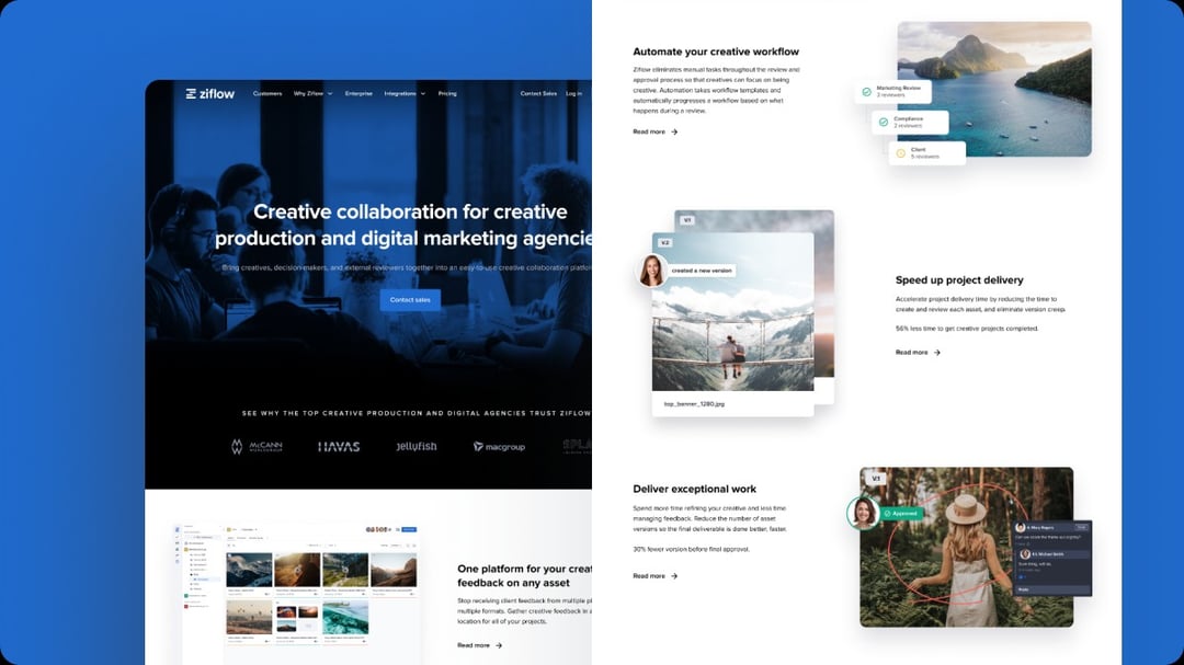
Recently, Ziflow’s creative team undertook a task that will be familiar to many brand teams and web designers: we redesigned, updated, and relaunched our corporate website with new messaging and visual branding. Our goal was to make our branding more visual, more video-centric, and demonstrate Ziflow’s creative collaboration capabilities.
That meant a serious overhaul of our web content as well as dedicating a large portion of our design team’s bandwidth to the project (while juggling all the regular design requests for marketing campaigns, product launches, and more!)
Our graphic and motion design team collaborated with our product team, creative director, CMO, copywriters and other team members to update dozens of new web pages with interrelated copy, images, videos, GIFs and more.
In this guide, we’ll break down how Ziflow’s creative team managed and optimized our web design review process to efficiently create and launch a complex website project over several months.
Common challenges in the web design review process
As Ziflow’s design team embarked on updating our website’s visual branding, our creative team’s project manager took stock of the expected challenges with web design projects. Common issues include:
Design files live across many projects and systems
Due to the multimedia nature of web design, design files and assets are scattered all over the place.
Within ongoing web design projects, prototypes may be created and reviewed in Figma by designers and then shared as PDFs with people outside of the design team. Video content may be developed in Adobe Premiere Pro and hosted on YouTube or other streaming platforms. Web copy may live in a Google Document. Live sites are staged in different environments that don’t always allow for markups and feedback.
Furthermore, each one of these files also must pass through several hands for review, creating hundreds of versions and iterations for a designer or project manager to keep track of throughout the design process--let alone know which one is the most "current" version. This quickly creates a disjointed asset management system and can lead to confusion as to which assets are the most up-to-date and approved for use.
At the start, our project manager Milena not only had to anticipate how we would approach new design innovation, but how we would manage and share the files produced throughout the website design project.
There’s no easy way to review staged or live websites
Despite how interactive web designs are when pushed lived, design teams often have to fall back on static methods-–email, PDF mockups, shared Google drives, Slack chat channels and more–for gathering feedback on web designs as they are developed.
These methods don’t capture the true interactive nature of websites, so reviewers aren’t getting an accurate look at how design options will function once it is launched. Staging environments help, but don’t usually include a way to capture feedback.
Our design team knew we would use Ziflow’s own live website proofing features to share designs for review and capture and compare versions and feedback throughout the process. However, our project manager also needed to decide at which point of the process the team would send a live or staged website for review outside of the design team.
There are a lot of stakeholders involved
Because websites are usually the most public-facing part of the brand or company, it’s natural for almost everyone in the company to have an opinion on layout, colors, copy, branding, image size, and every small detail of a webpage. However, the web design process can very quickly get bogged down with too much feedback and differing opinions and bring progress to a halt.
When feedback comes in from different sources and mediums, it can be difficult for a designer to prioritize changes or push back on comments that may not align within the scope of design. Ensuring the right stakeholders have a voice at appropriate phases of design is hard to juggle for even the most high-functioning design teams.
When our design team started the website design process, defining different phases of review for each review group--our content team, our executive team, our creative director, our product team, and others--was a top priority before any work began.
Design deadlines can be unrealistic
With many stakeholders comes the often unrealistic viewpoint that new website pages can be launched, by well, yesterday. Without a detailed view into the design production process, there can be an expectation that design work can and should happen more quickly than is possible.
Web design also relies on new image development or the creation of video content to be embedded on a page, which are entire projects within themselves that must go through a planning, review, and QA process with the larger vision in mind.
From the outset, our creative project manager had to decide on a realistic go-live timeline for each page and the production timelines for every element within each page. She also had to break down the project into manageable projects that kept both our design team and executive team aligned on progress every day. It was imperative that deadlines for each asset as well as the implementation of those assets were realistic for the full team’s bandwidth.
Our creative team’s step-by-step web design process
Tackling such a monumental project–with a relatively small team of designers–required our creative project manager to diligently control the web design process to avoid the issues listed above.
Here’s how our team managed and continues to manage the creation, review, and approval of new web content.
Project scope/briefing
At the outset of our website redesign process our web developer created a master spreadsheet cataloging each page of the website by section. This allowed the wider design team and our executive team to get a full snapshot of what needed to be updated, what pages could be discontinued, and agree on a prioritization of sections to redesign first.
Each web page then began with a project brief created by our Marketing Director, Product Marketing Director or Creative Director. The brief includes:
- The purpose of the page and its core messaging
- Design inspiration of similar pages or mood boards
- Section outlines and any suggested initial copy
- Ideas for specific graphics and animation
- Notes on functionality
The main purpose of this brief is not to dictate exact design choices, but to provide the design team with a strategic overview of each page and a standard template for project launch. This also helps take the guesswork away from our design team as to the purpose and messaging of each page, so they only need to focus on developing the design elements that best express that message, not defining project scope.
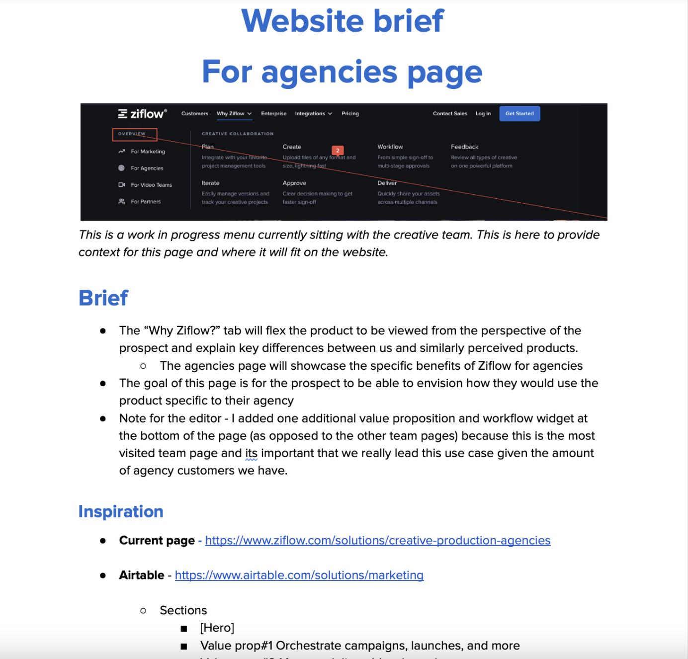
Here’s a snapshot of what a project brief used to initiate this web page describing how our product works for creative agencies:
Although we use our own Ziflow environment to manage the review of marketing content, our entire marketing and design team uses Asana to track the family of tasks and deadlines for creative projects.
Once a project brief is created for a new page or set of pages, our creative project manager Milena adds the project to the design team’s master workboard in Asana and build out every single related task associated with the production of the page, from copy to design layout out review and web QA. An related content -- such as animations, GIFs, copy or video -- that needs to be created by a separate team or subset of the design team is accounted for as a subproject or task so it can be tracked alongside the page layout work.
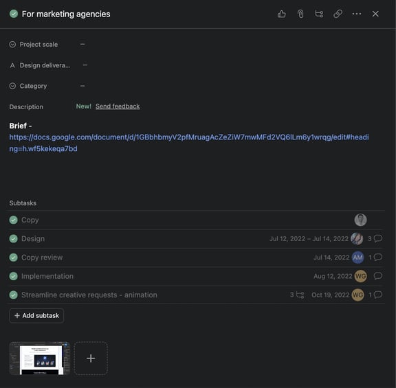
Our team works in two-week project marketing sprints, so only the tasks that can be realistically achieved in two weeks would be added to the team’s workflow for the upcoming weeks. Then, those tasks would be assigned to a designer on the team. Every other week, the team would have a planning meeting to discuss bandwidth and daily meetings to check in on the progress of each task.
This flow helped our design team break multi-part web projects into manageable chunks of work and track progress at a detailed level without micromanaging the actual design work itself.
Content development/SEO optimization
With the brief approved and added to our team’s sprint project management process and Asana board, the development of the copy for each page begins.
Our content/copy development process runs on a separate but related sprint process, so due diligence is done by our content team to develop copy for accurate brand voice, SEO/keyword optimization, and product accuracy. Having a separate content process helps shield our design team from late-stage copy changes and ensures the copy goes through rigorous review with our product and executive teams prior to design iterations. The final copy is typically added directly into the project brief in Google Docs for proper tracking and project management.
Design development in Figma
Once the copy has been approved by our content team, the assigned designer begins the design process for the page in Figma.
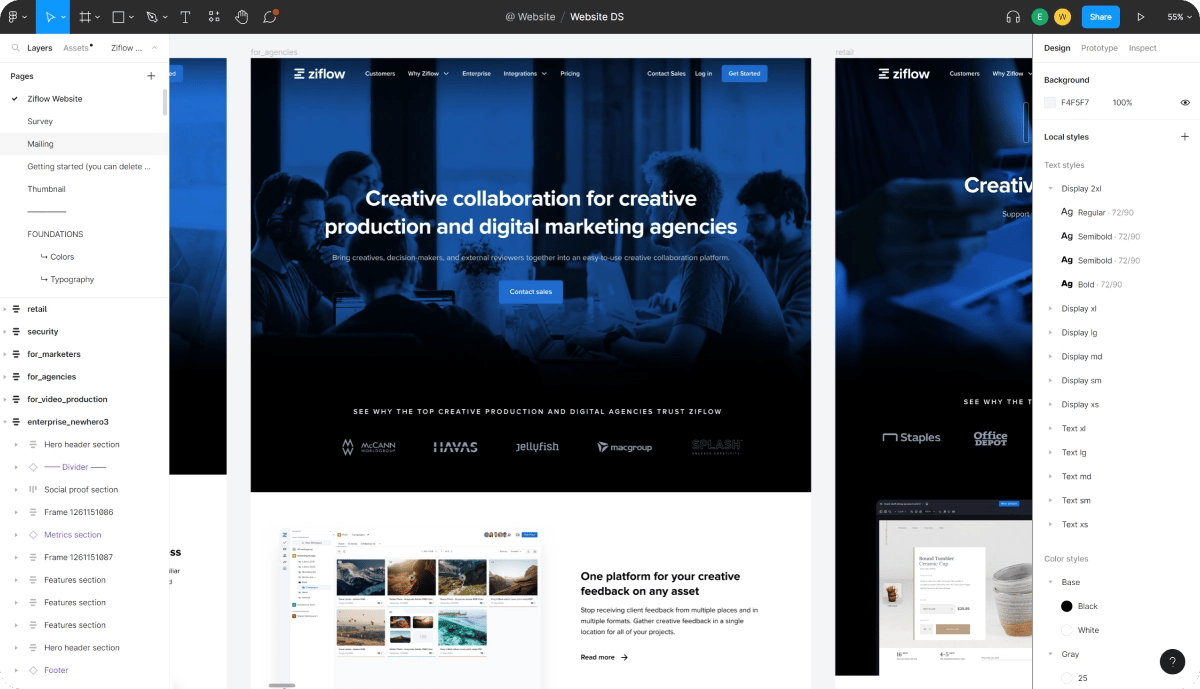
Notably, our design team developed a standard brand toolkit in Figma that outlines design standards and elements for each type of page. This enables them to "pre-load" design assets and work from a standard template instead of starting from scratch every time. Here's what our "Ziflow for Agencies" page in development looked like in development:
Internal design team review and approval
Once the primary designer has created a first draft of the page layout, the designer uploads the file as a static web proof in Ziflow for internal design review only by our creative director.
Having the first phase of review limited only to the design team has many benefits:
- It gives our designers space and time to develop concepts together without external input.
- Stakeholders who are unqualified in design expertise are not part of the initial design development and review phases and locked out of giving feedback too early.
- Designs can be compared against previous work that the design team may have deeper knowledge about.
- Initial changes and versions can be made without confusing the entire stakeholder "pipeline" as other reviewers are shielded from initial and often detailed iterations.
Stakeholder design review and approval
Once our Creative Director provides input onto a design comp and the design has been updated, the same proof is then shared with the relevant stakeholders for that page for input. This can include our Content Manager, our CEO, our Marketing Director and others. These reviewers may also be in phased stages depending on the page. Our design team may need in put from our Marketing Director first, and then a final copy approval from our Content Manager.
Being able to add in stakeholders to a web design in controlled stages helps manage feedback, comments, and iterations. Different stakeholders will be looking at web designs for different reasons and concerns. Phasing in different stakeholder review at predictable times helps guide the design process rather than impede it by addressing all of those concerns at the same time.
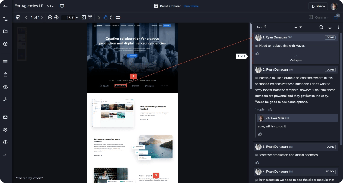
Here you can see how our "Ziflow for Agencies" page evolved prior to and during a review from our Marketing Director.
Live staging and website QA
Once all stakeholders have made an approval decision, our design team will share source files with our web developer who will begin to build the page on our web hosting platform.
This may also include the creation of triggered actions (emails, pop-up messages) within our web hosting platform related to the page, testing, adding to our website schema, and QA. This design build implementation work is tracked as detailed Asana subtasks for the project and added to the sprint by our project manager (again, this may be several weeks from the initial design work and occur in an entirely different sprint.)
Live staging review and approval (and launch)
Our web developer will then share the staged webpage as a live website proof in Ziflow with all project team members. Similar to previous iterations, the page is not launched until an approval decision has been made by key stakeholders for the page.
The top 3 tips for building an efficient web design review process from Ziflow’s design team
This creative workflow enabled our small design team to produce an incredible amount of multimedia web pages in just a few short months and to continue a consistent output of website design. Despite different designers working on each page and different stakeholders contributing to the strategy of different parts of our website, the pages all contain the same type of template, design style and standardizing branding.
As our creative project manager Milena reflected on our website redesign, here are her top tips for creating an efficient web design review process:
Create and use a defined brand toolkit
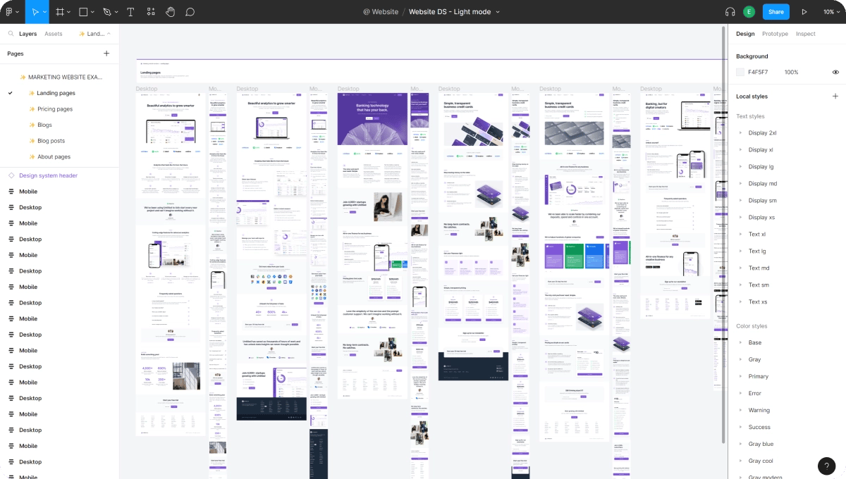
As noted above, our design team developed brand toolkits in Figma to streamline the development of similar types of pages. With these toolkits, our creative team can work from a template and apply the same set of design elements, creating a consistent look and feel across all related website pages and projects. This enables any designer to jump into a new web project or related page and start working within our brand guidelines–saving time on review later in the review process and expediting the design process.
Here’s a look at our master toolkit in Figma:
Break design work down into achievable phases
Web design work can seem like a free-for-all. To maintain prioritizing and efficient output throughout a long project, our team works in two-week sprints for project management.
In these sprints, the design team only takes on the amount of work they believe that can be realistically executed on given the team’s bandwidth in that time. This way, the website review process was driven entirely by design bandwidth and strategic priority, not just the most recent requests. This helped everyone work from the same expectations and enabled our design team to prioritize pages or a set of pages that needed to be worked on first.
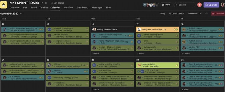
Here's a snapshot of what a two-week sprint looks like for our design team. Our web design projects are broken down into subtasks with individual deadlines, and prioritized against other marketing projects that require design work.
Set defined stages for stakeholder review–and limit stakeholders in each stage
For Ziflow’s creative team, breaking stakeholder review out into a separate step–and a separate proof–was crucial for protecting the design development process. For almost every page, our design team completed an internal review on a new website proof prior to distributing it for stakeholder input. By locking designs from wider review until the right time, stakeholders wouldn’t interrupt the design process and would see a more “complete” version of a design after it had passed an internal design QA process for brand consistency and functionality. Stakeholders wouldn't get bogged down trying to provide that feedback themselves.
This resulted in our team design being able to spend more uninterrupted time on the design innovation and branding process, and less time juggling or chasing down feedback.
A standardized web design review process offers big results for a small team
Ziflow’s internal design team functions like a small in-house agency within a growing company. Website optimizations and web design projects are an ongoing part of our marketing strategy.
With this process, our small design team was able to produce massive results with just a handful of designers for a new website project. It also enables our design team to iterate quickly as our branding, messaging, and corporate goals continue to evolve.
A streamlined web design review process enables our team to be nimble, flexible, and reactive–reducing the design “lift” needed for each project and allowing us to do great design work faster!
