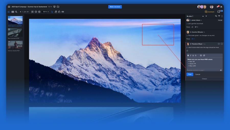
Marketing and creative teams are producing more content across more channels than ever.
But, for many teams, getting all this content reviewed, approved, and out the door is a struggle. Endless email chains, messy printouts, and limited markup tools just don't have the clarity, control or speed that teams need.
That’s why Ziflow is excited to introduce the New Proof Viewer—the most flexible, focused creative review environment ever.
Developed with insights from marketing and creative teams all over the world, the New Proof Viewer builds on Ziflow’s previous viewer, empowering teams to visualize their content clearly, get control over markup, and make feedback faster. This new second version of the viewer is available now in Ziflow.
Update (July 2021): Ziflow's new proof viewer now supports a full range of content types and includes additional interface enhancements.
Read on to see what modern creative review looks like and discover what’s new in the New Proof Viewer. Or visit the Ziflow Help Center for more resources on how to get the most out of the new viewer.
Visualize content clearly
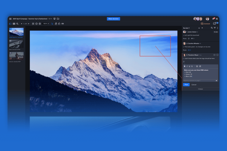
Maybe you’ve been reviewing creative with a PDF or image preview tool whose clunky interface makes it hard to keep your content in focus. Or maybe you’ve been printing your creative out for review, spreading physical copies of it out across a desk and getting lost in the process.
Or maybe you’ve even tried using a project management or standalone online proofing solution and found it doesn’t give you the control, accuracy or flexibility you need. Whatever the case, if your team is like most, you’ve experienced some version of this common but crucial challenge: clearly visualizing the content you’re trying to review.
Ziflow has always made it easy to visualize your content from multiple views and angles with high accuracy and resolution. But now with the New Proof Viewer, you can see and focus-in on your creative even more easily than before.
Put your content in the spotlight
The new viewer puts your content in the spotlight with a wide range of interface enhancements that improve your team’s review experience.
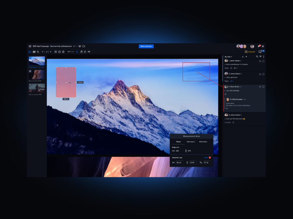
Streamlined Interface: The left hand menu bar is now hidden so that it appears only when you need it. You also now have the option to hide and resize the comment bar depending on what you’re trying to see.
Simplified controls: The New Proof Viewer also includes fewer buttons and more simplified controls. For instance you’ll notice the bar of buttons at the bottom of the viewer has been condensed and moved to the top of the viewer.
Navigation and rotation: The new experience also makes it easier to see your content from every angle. Within both continuous and magazine views, you can now rotate your content 360° to see the view you need. You can also now view different areas of your content more easily with the Navigator, which now automatically appears when you need it. The Navigator can also now be accessed within the list of proof pages as well.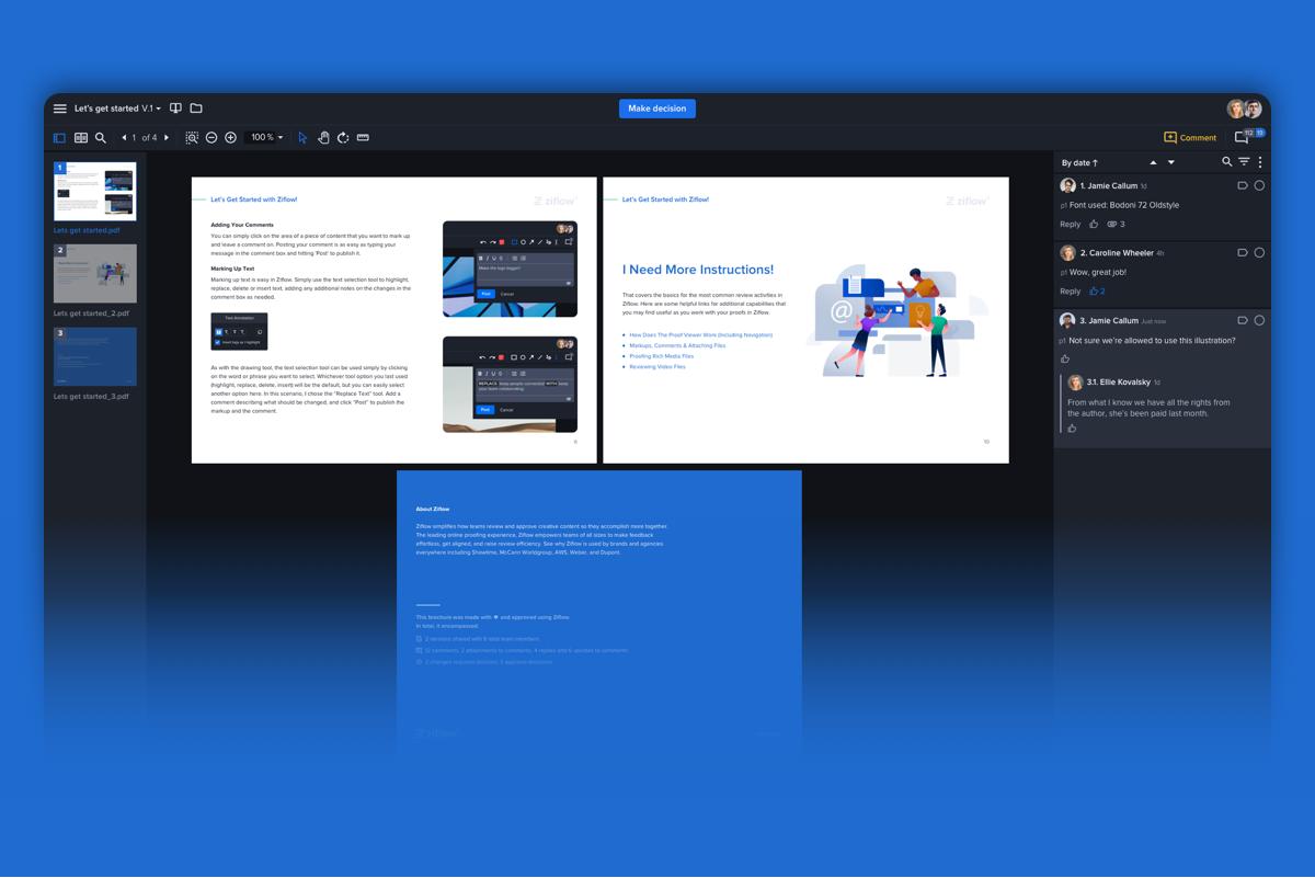
Easy Version Comparison: Your team can now more easily compare different versions of your content too. When viewing two versions side-by-side in Compare Mode, comments on each version now appear to the outside of your proofs rather than in between them. This way, with comments off to the side, you can more easily see the differences between your two versions.
Get markup mastery
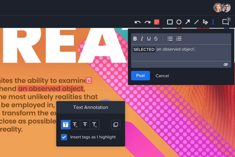
Even today, many teams reviewing creative content don’t actually mark it up at all. They send lists of comments and required changes through email or chat apps instead.
Without an easy way to visually point to or highlight what they’re talking about on a piece of content, they end up in an endless back-and-forth that’s as confusing as it is inefficient. And even for those teams that do use a tool with markup features, the markup process still feels clumsy, slow and frustrating because the tools are so limited.
Teams in Ziflow have always had access to robust tools that make clear, accurate markup possible. With the New Proof Viewer, these tools are now more adaptable, making markup a breeze.
More flexibility, more control
Your team can now easily move and adjust the drawing, text select, comment and other Ziflow markup tools, giving you greater flexibility and control.
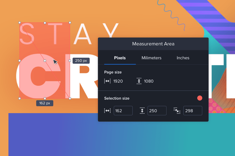
Flexible tools: With the new viewer, your team can now move the text and measurement tools around the screen, bringing them closer to the areas of content where you want to use them. In addition there is now a stand-alone ‘Add Comment’ window that’s always available so you can easily add comments without needing to see or navigate the entire comment bar.
In addition to moving your markup tools themselves, you can also move forward and backward through the changes you make with them, easily undoing and redoing drawing’s and text selections.
Finally, you can now easily adjust exactly where your text select highlights start and stop.
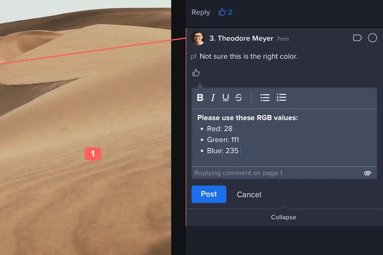
Rich text comments: To help your team improve collaboration, the new viewer also allows you to craft comments with Rich Text. Communicate exactly what your team needs to know by bolding, italicizing and striking text out, creating bulleted lists, and more.
Make feedback faster
Feedback. It's at the heart of your team’s review and approval process. Giving it, getting it, tracking it, storing it—nearly every review process revolves around feedback. 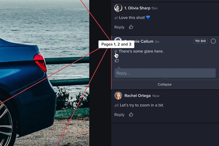
That’s why inefficient feedback processes waste so much of teams’ time and energy. That process might be trying to sort through and find existing feedback, connecting related feedback across multiple pages or areas of a piece of content, or it might simply be needing to give a lot of feedback in a reasonable amount of time. The problem of feedback is so persistent that even the online proofing tools and project management features supposed to solve it lack the capabilities needed to do so.
From threaded discussions and easy version management to robust markup tools and automatic version comparison, there are many ways that Ziflow already makes feedback more effortless. But now, with the New Proof Viewer, the feedback experience in Ziflow has gotten even easier with capabilities that drastically reduce the time it takes to give and track feedback.
Quickly add, track, and search comments
With the New Proof Viewer, you can now more easily add, track, and search comments—saving your team hours in the process.
Quick, continuous Commenting: One of the most exciting enhancements in the new viewer is the ability to quickly and continuously add comments to a proof.
In order to draw a shape or highlight text in the area you want to add a comment, you no longer need to select the draw or text select tools—you can now simply click on the area of content you leave your comment and start drawing or highlighting right away.
Need to leave multiple comments? You can also now add them continuously, one after another, without needing to click “Add Comment” before making each one.
Cross-Page Comment Tracking: The new viewer makes it much easier to track related feedback across multiple pages or areas of your content. One of the key ways the new viewer does this is by automatically switching you to the layout view needed to see cross-page comments and markup.
For instance if one of your reviewers circles a section of content (such as a paragraph) that cuts across multiple pages in the continuous view layout, then when other reviewers click on that comment they will automatically be brought into the continuous view layout so they can see that markup. That way, reviewers can quickly see, understand and respond to cross-page feedback.
It’s also now easier to track even the most sprawling comments that are attached to many separate areas or pages of a piece of content. For those comments too, you’ll be able to see and follow where all of those comments are placed no matter which view layout you’re using.
You’ll also now see an icon next to multi-page comments showing you exactly which pages the feedback is attached to so your team can quickly sort through multiple pages of related feedback without any of it slipping through the cracks.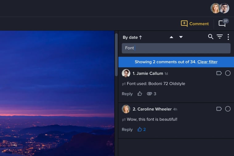
Improved Comment Search: Trying to search through all your team’s feedback to find a particular comment on a proof? The new viewer now has improved comment search and filtering capabilities. In addition, deleted comments will now be hidden by default to make searching and reading through comments easier.
And more
The New Proof Viewer also introduces many other touches and enhancements to improve your team’s review and approval experience, including faster performance and the ability to search folders for proofs by name. Look out for even more improvements coming soon.
Already using Ziflow?
If you’re a current Ziflow customer, the new version of the viewer is available to you as a free, optional update. Your team's Ziflow Admin can update the viewer from within the 'Proof Viewer Versions' of Account Settings.
To help you decide whether the update is right for your team, see the Help Center on key differences between this new second version of the viewer and the earlier first version. There you will also find additional resources on navigating the new viewer.
You can also see a walkthrough of some of the highlights from the new viewer in the official release webinar on April 15th. Register below.
Never tried Ziflow?
If you still haven’t tried Ziflow, now’s the time to see what modern creative review looks like.
Join us for our special event webinar on Thursday, April 15th at 10am PST / 1pm EST to see the New Proof Viewer and learn why brands and agencies everywhere have moved their creative reviews from email, printouts and limited proofing tools to Ziflow.
