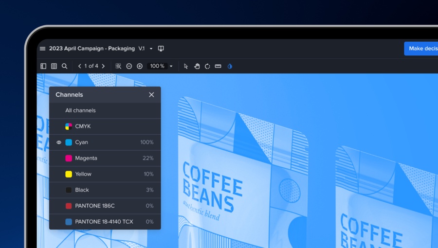
Are you tired of having to go back and forth between different software and tools to view your CMYK and Pantone colors accurately? Annoyed that different monitor displays seem to make pixel-perfect color matching almost impossible?
Say goodbye to those headaches with Ziflow's newest feature: Color Separation.
With this feature, you can now view your CMYK and Pantone colors in real-time while reviewing creative assets. No longer will you and your reviewers spend time figuring out exactly how your colors will appear in print. Whether you're creating assets for packaging, outdoor media, brochures or any other physical material, Color Separation makes color comparison in your proof review process much more precise, so you can ensure that your final designs look their best in print.
Now, you can be sure that what you see on your screen is what you'll get in print. The ability to view accurate color representation during design development ensures that your assets will look their very best when printed.
Moreover, this new feature makes it easier for teams to collaborate and make informed decisions about their designs. No more miscommunication, mistakes or lost time verifying the fidelity of design–Color Separations ensures everyone in the review process is viewing the same color accuracy.
This feature is available today for PDF file types, with more formats (INDDs, PSDs, etc) to be added in future releases.
If you're a design or marketing team that wants to streamline your workflow and ensure that your designs look their best, Ziflow's Color Separations is a must-have. Upgrade to Ziflow today and experience the difference.


