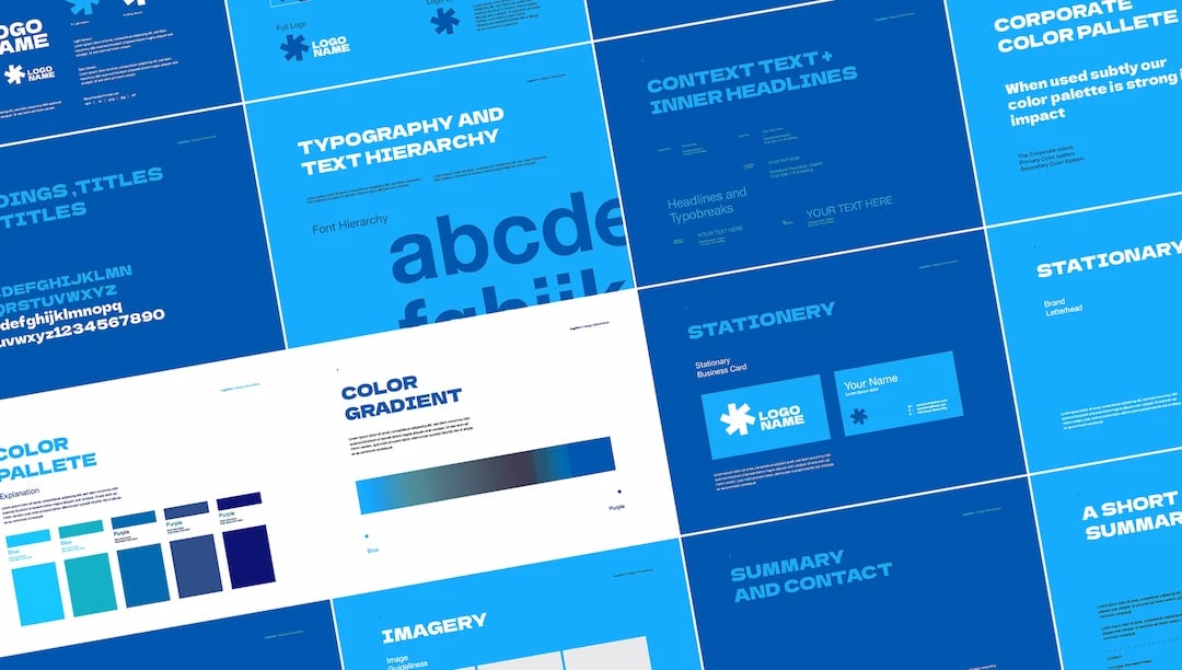
A strong brand is your ace in the hole, it’s your superpower. You’ve fought hard for it, and it’s one of your most valuable assets. It makes you instantly recognizable, trusted, and understood.
But it's not indestructible. Your brand image can be weakened by something as small as an X post in the wrong tone or removing the oranges from your orange juice.
That's why you need brand guidelines: so that every piece of content that comes out of the business follows brand compliance.
In this article, we'll take a look at how your creative team can create, maintain, and use brand guidelines with examples from some of the greats. But if you’re still hungry for more details about setting up your guidelines, don’t worry — we take a deeper dive into brand briefs in our brand briefs article, so be sure to check that out!
What we'll cover
Table of contents
What are brand guidelines?

It doesn’t matter if you’re a car dealership or SaaS powerhouse, every business needs brand governance.
That means developing the brand and making sure it's present in everything the company does — like stripes running all the way through a tube of toothpaste.
Brand guidelines are a set of rules for brand consistency that everyone on your team can read and refer to. Your creative team can even share them with freelancers and outside contractors.
They make sure no one contradicts, dilutes, or misunderstands the brand.
What should brand guidelines include?
Brand guidelines are a comprehensive set of rules that everyone on your team should know inside out.
Today, we'll look at:
- Brand story and values
- Visual identity
- Messaging and voice
- Application examples
If it sounds like a lot, don't panic — brand guidelines aren’t written overnight, and you don't necessarily need a unique and original approach for every single thing.
As brand strategist Nick Liddell explains, not every brand asset has to be eye-catching and different. "[But] in context and in combination, they are highly distinctive.” Ordinary, non-distinctive elements of your brand can still help customers recognize your brand and orient themselves.
They don't have to be unique, but they do have to be consistent. That's what the guidelines are for.
Brand story and values
Your brand guidelines should start with three key principles:
- Describe your purpose and core brand values in just a few sentences.
- Describe the characteristics of your brand as if it were a person.
- Explain the origin story of your brand. This should include what makes it different from competitors.
These elements inform the rest of your brand guidelines. Values, personality, and backstory all affect the visual elements and voice of the brand's content.
And believe us — consumers care about them. Take a look at this research by Deloitte that illustrates how brand purpose is a competitive advantage in the market.
Visual identity
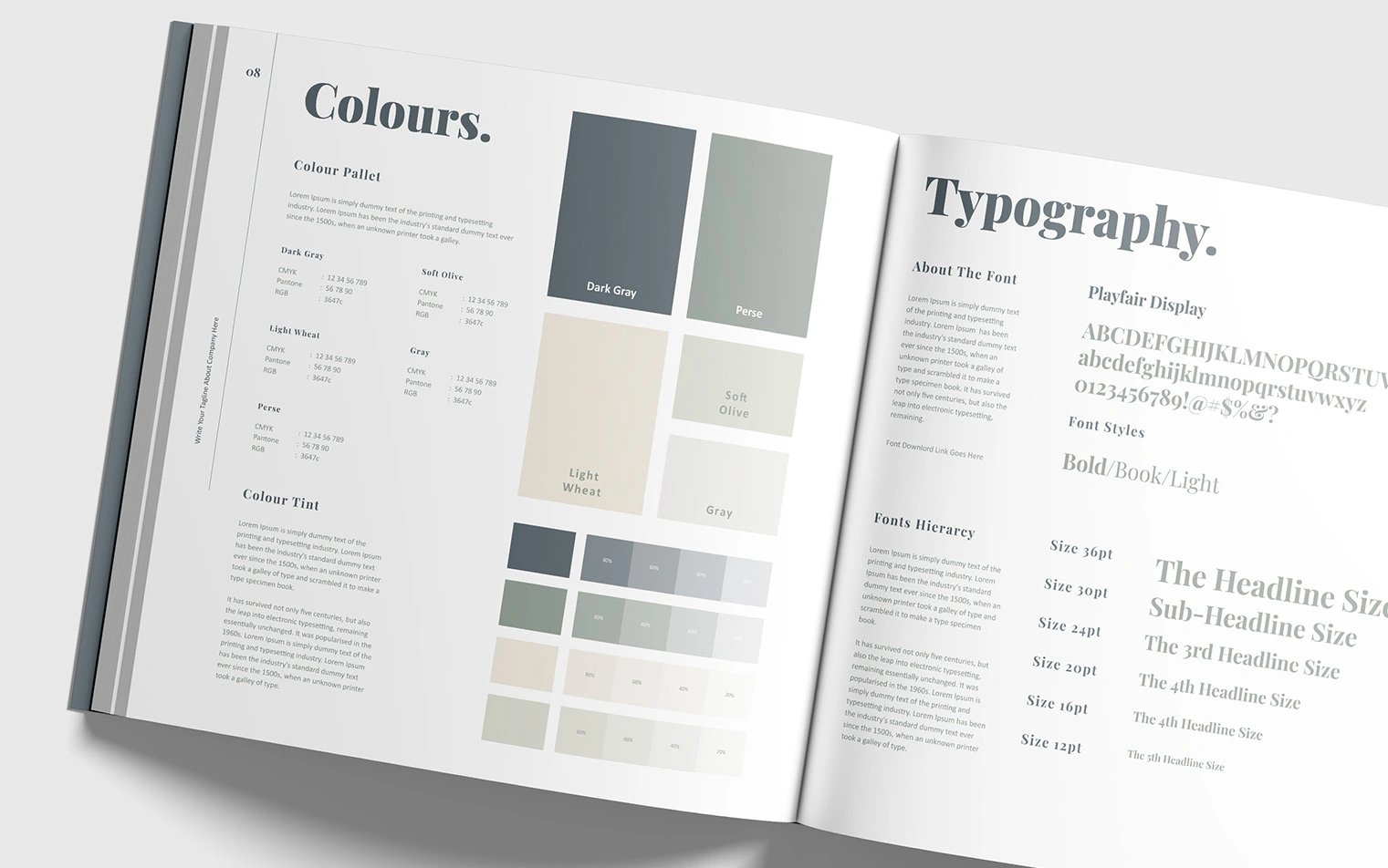
Graphic design elements are the most visible aspect of your brand. They can help customers recognize and recall your brand in an instant. Visual branding like brand colors can even improve brand loyalty.
Because your visual brand is so powerful, it should be consistent across communication channels and brand materials.
- Brand logo: As well as the basic logo design, you'll need detailed specifications for logo usage. Include primary and secondary versions, acceptable color variations, minimum size requirements, and specifications regarding when and where to use it.
- Brand color palette: Define the official color scheme for your brand, including primary colors, secondary colors, and accent colors. Include color codes for easy reference.
- Typography: Choose font families that match your brand. Define the usage of different typefaces for headings, body text, and logos. Set guidelines for font sizes and effects like bold or italic.
- Imagery: Cover everything from photography to illustrations, animations, videos, and iconography. Decide where imagery should be used and what edits or manipulations are acceptable.
- Channel-specific: Design elements can vary across channels, so you'll need to include specific guidelines for all the different media you use. You'll also need up-to-date character limits and image dimensions for social networks.
- Accessibility: This applies to all kinds of content, but it's especially important for visual brand elements and interactive media, where accessibility needs are often overlooked. Accessibility can also be a source of brand strength and goodwill.
Messaging and voice
Tone of voice isn't just a copywriter’s game. Everyone who speaks for your brand — from customer service to billing to developers adding tooltips — has a responsibility to follow consistent branding. It’s a team sport.
- Brand voice: Build on the brand personality that you've already defined. This isn't just about how you speak; it's also about what you say and how you speak up for your brand values.
- Brand tone: Tone of voice is different from brand voice itself. Different tones will be appropriate in different settings: for example, most brands are more casual on social media than email, but their essential voice stays the same.
- Messaging framework: Define key brand messages that should be shared across all your communication channels.
- Do's and don'ts: From words to avoid to your feelings on the Oxford comma, use guidelines to avoid repeated errors or minor issues.
- Channel-specific: Just like visual brand design, your messaging can be channel-specific.
Application examples
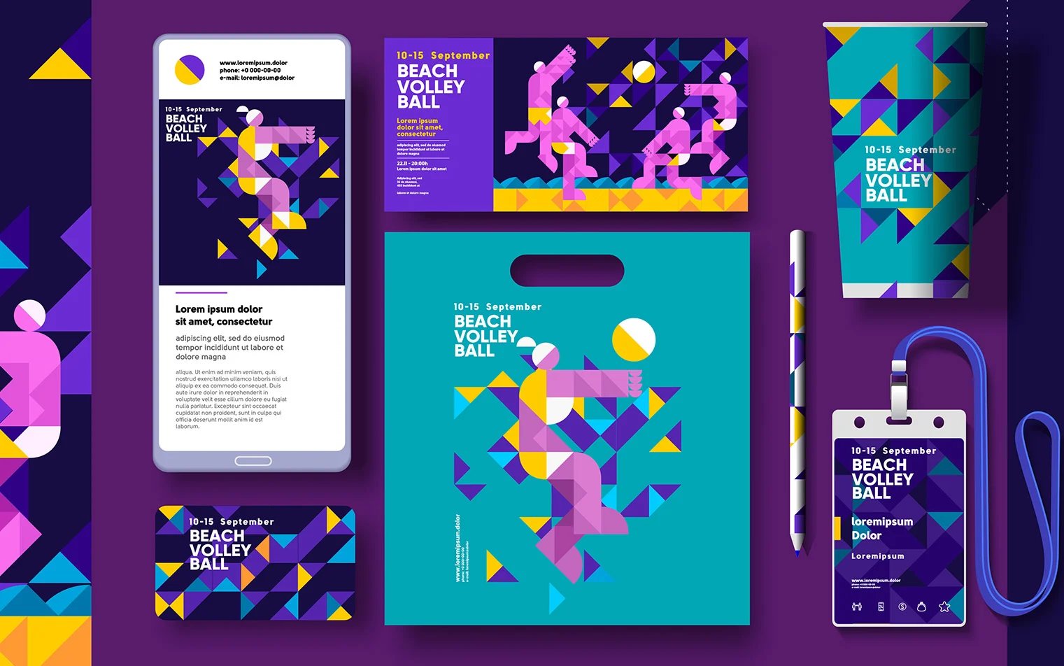
The best brand guidelines include real, visual examples. This helps everyone on the team see exactly what correct branding should look like.
It's especially helpful if you're rebranding or setting up a new brand, where the guidelines will be unfamiliar.
- Mockups: Create artificial guide examples to show your team. This is a good choice if you don't have many real-life examples yet.
- Templates: Templates serve double duty. As well as guiding your creative team, they can also speed up workflows. Users just have to fill in the specifics.
- Case studies: These can show your team what not to do, as well as examples of success stories.
- Brand guidelines: The guidelines themselves should follow your branding strategy. When every last detail is on brand, it serves as a helpful guide — and a reminder that nothing is exempt from branding.
6 examples of effective brand guidelines
Some of the biggest brands in the world have made their brand style guides public. That's part of brand governance when you know people will regularly talk and share about your brand.
But it's also a chance for you to pick their brains. We've found six examples of brand guidelines that we think really hit the mark and hopefully inspire you.
1. Asana
Asana is a productivity platform that aims to streamline work. Their brand is clean and clear-cut to match their mission.
The Asana brand guidelines mainly focus on the Asana logo and how to present it: plenty of whitespace and no clutter. But if you look at the platform itself, you'll see how their branding is built into everything they do.
From colorful minimalist animations to sans-serif fonts and a spacious dashboard, everything about this brand emphasizes modernity and efficiency. Even the help pages are written in crisp, clear prose.
2. Slack
Just in case you're on the one creative team in the world that doesn't use Slack: it's a workplace messaging platform. Their mission is "to make work life simpler, more pleasant, and more productive.
So there's a lot of minimalism — like Asana — but being fun is also a key part of the brand. That's why Slack is full of bright primary colors, playful illustrations, and warm, friendly writing.
Their media kit includes a deep dive into Slack's values, design, voice, typography, and even how animations should move. It's a thorough, comprehensive guide to making the platform live up to the mission.
3. Spotify
The music streaming giant Spotify knows that their logo gets shared everywhere. That's why Spotify's brand design guidelines include strict rules for using it — including helpful visual examples and channel-specific details.
They've also written up rules for how to present Spotify content if you're sharing it on another website or app so that the branded experience is never lost.
4. Skype
Skype is an online video chat platform that describes itself as "for the people.” Their brand guidelines are designed to reflect a down-to-earth, human approach.
The Skype brand book uses a handwritten-style typeface with speech bubbles, cartoons, and jokes. It's an interesting approach because that's not the visual style that Skype uses for communicating with customers… but it does represent the brand voice and values.
And you'll notice that for the important points, like how to present the Skype logo or which RGB color codes to use, the guidelines revert to a more standard style.
5. Netflix
Netflix's brand guidelines are styled like a cinematic experience, just like the streaming service itself.
Key rules and visual examples are shown against a dark backdrop that increases their impact. The guidelines are comprehensive, covering everything from spacing to colors, contrast ratios, and co-branding logos.
6. Uber

Ride-hailing app Uber projects an image of style, ease, and convenience. And the Uber brand guidelines are perfectly in sync: elongated typefaces, monochrome design, and plenty of whitespace.
They also include a comprehensive database of different product logos in a range of versions and languages, reflecting their global presence.
Tips for establishing and maintaining brand guidelines
Creating your own brand guidelines is a project that should make your work easier and more effective. It's an investment of effort that has big returns.
Before you get into the ground-level details of typography, graphic design, and tone of voice, here's what you'll need to do.
Define your core values
Your brand's purpose and values are the foundation for everything else. They shape how your brand behaves, its personality, and its relationship with customers, employees, and stakeholders.
For example, if you’re a brand that uses recycled materials in all of its packaging, one of your core values might be sustainability or reducing carbon footprint.
Messaging, design, and voice are all expressions of your fundamental brand mission. They make up how you want customers and the general public to see you, and define how your brand is different from the competition.
Research and understand your audience
Your brand should reflect your target audience, as well as the company's own origin story and purpose. Researching your target demographic will help you create a brand strategy that speaks in the right way to the right people.
Include examples and real-world applications
Examples of your own branding will help to clarify and illustrate guidelines. It can also make your guidelines more engaging for visual learners.
Say you’ve recently updated your website to reflect your new branding. You’ve changed colors, messaging, and images. While it’s great (and recommended) to outline requirements in text, consider including screenshots of relevant site assets.
These serve as good examples of what new assets should try to emulate, help set expectations, and ensure that everyone involved in your branding efforts is aligned with your brand vision and values.
Make it accessible
If your brand guidelines aren't accessible, they're unusable. Everyone who works with or for your brand should be able to access the guidelines in full.
And while we're at it — do your brand guidelines include accessibility standards for the content you create?
Build brand compliance into workflows
The best way to get people to do something is to make it the easiest option. Set up branded templates and workflows that make it simple for your team to follow the guidelines. Brand compliance tools can help people check their work in progress and make sure it's staying on track.
Adhere to brand guidelines easily with Ziflow
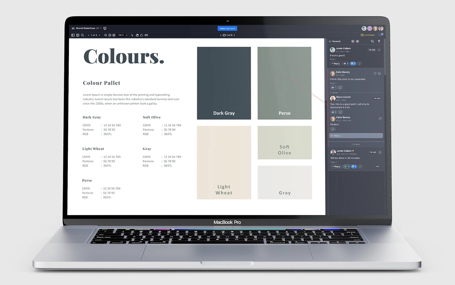
Ziflow’s collaborative proofing software streamlines the creative review and approval process, centralizing all feedback and asset versions under one digital roof. Markup tools, comments, robust version controls, and automated assignment workflows keep your team and clients aligned and working on the same, most current version of an asset at all times.
And it doesn’t stop there. With brand and marketing compliance tools, Ziflow also makes it easy to ensure your assets adhere to your brand guidelines — leading to consistent, compliant assets.
Great brand guidelines are your blueprint for a consistent brand image across all of your marketing channels and customer touchpoints. They clearly define your brand’s personality right down to messaging and tone of voice, ensuring that every interaction a customer has with your brand is a strong, true reflection of your company and its values.
But the more your organization grows, the harder it can be to maintain those guidelines. Team members might be distributed, and vague or loose guidelines can get misinterpreted and evolve into inconsistent messaging and design across assets.
With the right support from templates, workflows, and compliance software, maintaining branding consistency is easier than ever. The right software solution can offer automation features that remove the manual element of the review and approval process, automatically including required decision-makers. This way, stakeholders can flag any deviations from brand guidelines for review or revisions, keeping everyone aligned toward the same goals.
At the end of the day, whether you’re developing a new brand, implementing a rebrand, or maintaining an existing brand, using Ziflow will ensure that the creative campaigns you deliver adhere to the carefully crafted brand guidelines that you have in place to protect your brand’s value.

With a track record that spans media giants like WarnerMedia, Viacom, and Google, Aaron's expertise shines through in multi-million dollar projects across various mediums, from traditional television to the dynamic realm of YouTube.
