A strong brand design is much more than just a logo or color palette — it’s the foundation of a company's identity and its connection with customers. Great branding tells a story, leaves a lasting impression, and influences buying decisions. It also forms the basis of your brand guidelines, which ensure consistency across every touchpoint.
In this article, we’ll explore the key steps of the brand identity design process, provide some leading brand examples, and discuss essential tools you can use to create a strong brand identity.
What we'll cover
Table of contents
9 key steps in the brand design process
Strong, consistent branding is essential in today’s competitive markets. According to consumer reports, 46% of Americans spend more on a product from a brand they trust—which means your brand needs to be instantly recognizable. But where do you start building a brand identity?
While every company's brand design process will vary depending on its goals, budget, and target audience, there are several essential steps that shouldn’t be overlooked.
Whether you’re establishing a brand design for your own company or a client’s, these steps will help you develop a cohesive visual representation that makes a lasting impression.
1. Onboarding and discovery
The first step in a successful brand design process is getting to know the company. You’ll need a thorough onboarding process to gauge the company's personality, vision, goals, values, and existing branding elements. This is an important stage as it sets the foundation for the rest of the design process.
Typically, you’ll need to create a brand brief to guide the creative and marketing teams. To better understand the client and their brand, your questionnaire might include questions like:
- What type of company are you?
- What are your company's core values and mission?
- How do you want customers to perceive your brand?
- What kind of image do you want to portray?
- Do you have an existing brand style guide?
You can also conduct a brand audit to evaluate any current branding elements and identify areas for improvement. It's important to discuss the budget, timeline, and deliverables at this stage to ensure everyone is on the same page moving forward.
2. Market and user research
Design without market research is like sailing without a compass — it's bound to go off course and miss the intended audience. Market and user research help you understand the target audience's behaviors, preferences, and needs.
Additionally, researching competitors and industry trends helps you identify gaps in the market, design flaws to avoid, and unique selling propositions (USPs) that can set your brand apart.
Some areas to focus on during this phase include:
- Target audience demographics — age, gender, location, etc.
- Competitor analysis — brand messaging, visual identity, market positioning
- Industry trends in design and branding
- User feedback and pain points with existing brands
Once you pinpoint what works and what doesn't, it gets easier to define your brand's unique selling points and differentiators.
3. Brand strategy and concept development
Once you have tangible data on the target audience, market trends, and competitor analysis, it's time to develop a comprehensive brand strategy. This includes defining the brand's positioning, messaging, and core concepts that will guide the graphic design process.
Brand positioning refers to the unique perception or image of your brand in the minds of consumers. It conveys what makes your brand different and better than competitors. On the other hand, brand messaging involves crafting a consistent voice and tone for all communications that convey the brand's values and personality.
Finally, core concepts are the central ideas or themes that encapsulate your brand's essence and values. These include the brand name, tagline, story, and personality. Brainstorming sessions, idea mapping, and mood boards can help you develop a strong foundation for the brand's design direction.
4. Design brief
A design brief is a one or two-page document that maps the visual direction and aesthetic of the brand. It acts as a guide for designers to ensure all design decisions align with the client's goals and vision. While its components may vary depending on a client's requirements and the project's scope, a good design brief typically includes:
- Company overview, including target audience, vision, mission, and values
- Goals and objectives of the project
- Top competitors
- Design inspiration and references
- Project timelines, budget, and deliverables
- Project approval, including the number and frequency of versions and design mockups
A design brief is an essential tool that sets the client's expectations and helps designers stay on track and within budget. It also serves as a point of reference throughout the design process to ensure all elements align with the overall brand strategy.
5. Color palette and typography selection
Selecting the right colors and typography for a brand is crucial, as they have a strong psychological impact on consumers.
The right color palette can help establish your brand's feel and personality, making it easily recognizable and memorable. Similarly, typography plays a significant role in creating a cohesive visual identity for a brand. Depending on the brand's personality, a well-selected font can communicate professionalism, creativity, or playfulness.
The key is to choose colors and typography that match the brand's messaging and target audience. For example, a children's toy brand will opt for bright, playful colors and fun fonts, while a luxury brand leans toward sophisticated, elegant color schemes and classic typography to create a memorable brand experience.
6. Visual elements and design assets
A brand's visual elements, especially its logo design, are often the first thing consumers notice. They are powerful communication tools that convey the brand's message, values, and personality in a single image.
Take McDonald's golden arches or Nike's iconic swoosh. These visual elements have become synonymous with the brands and are recognized worldwide. You don't need to see the brand name—a glimpse of these symbols is enough to identify the company immediately.
Beyond logos, designers create other design assets, such as imagery, patterns, and textures, that align with the brand's visual direction. These elements help establish consistency across all platforms and create a cohesive visual identity for the brand. If a brand's visual direction is minimalistic and modern, designers may use clean lines, neutral colors, and simple imagery to convey this aesthetic.
7. Channel-specific design concepts
Due to the many touchpoints brands can use to communicate with their audiences, it's important to adapt the visual identity across all channels and platforms. Designers should create channel-specific design concepts that maintain consistency while catering to each medium's requirements.
Think about social media, where every platform has different graphic design requirements — which are much different than those of print materials like brochures and business cards. Designers must consider factors like image resolution, dimensions, and color profiles to ensure the brand's visual identity remains consistent and effective across all channels.
Additionally, each channel serves a different purpose and caters to a particular audience. So you may need to adapt the visual elements and messaging to resonate with the target audience on each platform.
8. Design review and approval
Once the initial designs are ready, it's important to gather feedback and input from stakeholders before finalizing them. This step helps address any client concerns or suggestions regarding different logo variations, color palettes, or design elements. It also allows for necessary revisions to ensure the designs align with the brand's objectives and messaging.
If the client feels that the shapes and symbols used in the design do not align with their brand values, they can provide feedback to the designer, who can then make appropriate adjustments. Stakeholders may also suggest incorporating specific elements or concepts that better represent the brand's messaging or target audience.
9. Finalize style guide and deliver design files
The last step in the branding design process is finalizing the style guide and delivering all necessary design files to the client. The style guide is a comprehensive reference for all visual elements, including logo usage, color palettes, typography guidelines, and design assets. It ensures consistency in the brand's visual identity across various touchpoints and serves as a guideline for future designs.
Along with the style guide, designers deliver all final design files in various formats, such as vector graphics, high-resolution images, and web-friendly versions. These files are essential for implementing the brand's visual identity across different platforms, helping maintain brand consistency.
4 great brand design examples
1. Airbnb
Do you remember when Airbnb looked like this?
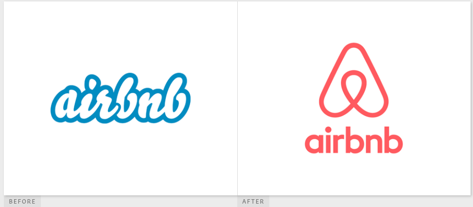
Before San Francisco-based DesignStudio was enlisted by the company to transform its brand design, this is how the company promoted itself. During its rebrand, Airbnb modernized its logo and typography to create its now instantly recognizable "A" symbol.

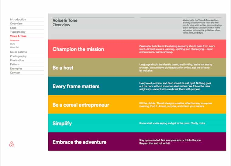
The brand redesign moved the company to a cleaner, simpler aesthetic to make it unique while remaining universally recognizable. Airbnb now follows a simple set of brand guidelines to control different messages between the company, hosts, and marketing materials.
2. Heart & Stroke Foundation
When Canada's Heart & Stroke Foundation decided to overhaul its branding, it also looked for a more simplistic approach. The overall goal was to take the previous logo, which was very crowded, and distill it into a more straightforward message. The result? The new logo has two elements: a heart and a stroke.
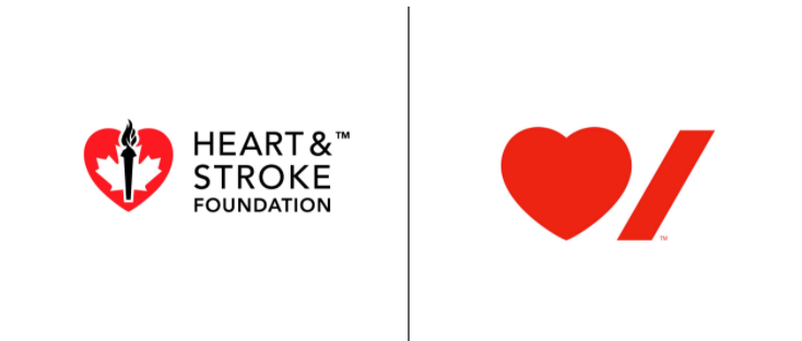
The new design has also made it easier for the foundation to use its branding across multiple platforms, like publications and campaigns, using English and French versions.
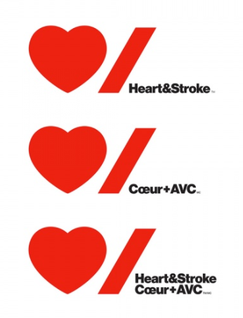
Now the foundation can maintain consistent messaging across every division, from community-based fundraisers to corporate events and even gifts sold to raise funds.
3. Deliveroo
When Deliveroo first started its food delivery service, its branding was very literal. It was a kangaroo… delivering food.
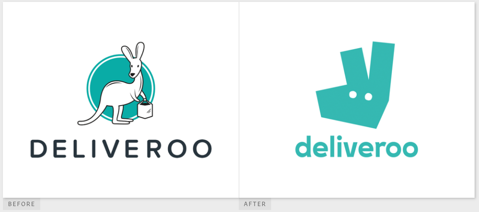
As the company started to grow, it knew it needed something more modern and progressive. The company's new design takes a modern approach to the company's kangaroo, simplifying it into an easily recognizable logo.
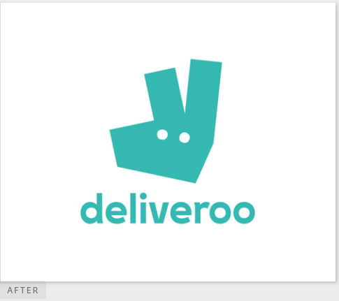
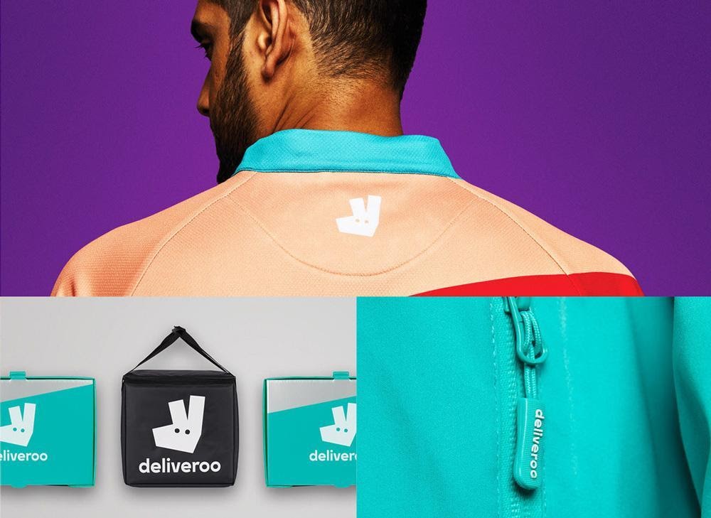
The new brand design not only showcases a bold color swatch, but the custom typography on the "V" also matches the shape of the kangaroo's ears. The entire design works seamlessly with other parts of the company's graphic needs, and it has since been rolled out onto other elements of their business, such as uniforms and delivery bags.
4. ZenDesk
When Zendesk first appeared on the software service scene, its brand design consisted of a Buddha wearing a headset and bright green typography. Then, the company decided it was time to change.
The company's design team knew that, although the Buddha image worked well for them at the beginning, the service had outgrown the image. It was time to change it up and modernize it. So, they did:
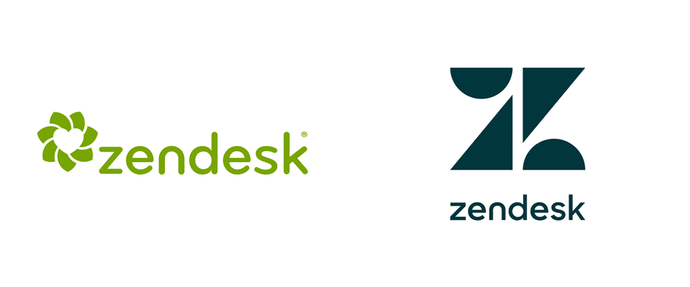
The new brand design gave the company a more modern looking logo and simpler shapes to work with. Now, it’s instantly recognizable and sends a clear message that Zendesk has moved from startup to established brand.
What tools are essential for the brand design process?
A seamless brand design process demands the right tools. From ideation and conceptualization to final execution, designers use various tools to bring brands to life. These tools help simplify processes, maintain consistency, and ensure effective communication among team members. Let's take a look at some essential tools that are commonly used in the brand design process.
Project management software
The brand design process involves many moving parts, which, if not managed properly, can lead to delays, miscommunication, and confusion. Project management software allows designers to:
- Create, organize, and assign tasks to team members
- Set project timelines and deadlines
- Share files and collaborate with team members in real time
- Track progress and monitor the status of different tasks
- Set reminders and receive notifications for upcoming deadlines
Most project management tools include Kanban boards, Gantt charts, and task lists, which help teams stay organized and on top of their responsibilities. This ultimately ensures the process stays on schedule, designers accurately track time for billing, and stakeholders can easily monitor the project's progress.
Digital asset management (DAM)
Security is a top priority when it comes to brand assets. You don't want to risk losing or sharing sensitive information with the wrong people. DAM systems provide a centralized location for storing, organizing, and sharing critical brand assets, enabling secure access to files across teams.
This streamlines project workflow management and ensures that all team members have access to the most up-to-date assets, avoiding confusion or inconsistencies in brand design.
Other benefits of DAM systems include:
- Efficient search and retrieval of assets through tagging, metadata, and advanced search filters
- Version control to track changes made by different team members
- Scalability to handle large files and multiple users
The right DAM system will help save time, reduce errors, and improve collaboration in the brand design process.
Collaborative proofing platform
A full brand design process typically involves reviewing and approving different versions and iterations of design drafts. Without a proper proofing system, this can be tedious and time-consuming.
To cut the back-and-forth on design revisions and feedback, use a collaborative proofing platform like Ziflow. These tools allow stakeholders to review and comment directly on design drafts, highlighting areas for improvement or requesting specific changes.
Revisions become more efficient, and the risk of miscommunication is reduced. Plus, with all feedback in one centralized location, designers can easily refer to previous comments and track changes made.
Some features of collaborative proofing platforms include:
- Annotating tools like text boxes, drawing tools, and highlighting options for adding comments and suggestions to design drafts
- Version control to keep track of changes made during the review process
- Real-time collaboration and notifications to keep everyone on the same page
- Customizable approval workflows to ensure that reviews go to the right stakeholders at the right time
Why integrate PM, DAM, and proofing tools?
With disconnected systems, you run the risk of unintentionally siloing creative teams. Designers may not know when the copy is ready, or where the approved copy lives in order to incorporate it into the design. Approvers may lose track of multiple Slack threads linking to several different versions of the design and accidentally provide feedback on an older version (which wastes everyone’s time).
When tools don’t talk to one another, the result is miscommunication, lost assets, and delayed approvals. Well-integrated systems give creatives, project managers, and client stakeholders access to the latest version of assets so everyone can work from the same iterations and provide feedback in real time. This ensures that nothing goes missing and fosters better, more effective collaboration, which ultimately maintains brand integrity.
Research and discovery tools
Research will help you uncover the brand’s strengths and weaknesses, identify potential opportunities for growth, and better understand the target audience. So you’ll need tools that can help you:
- Conduct a market analysis to understand trends, customer preferences, and potential gaps in the market
- Benchmark the brand to see how it compares to competitors in terms of design, messaging, and overall branding
- Gather user insights through surveys, focus groups, or online forums to understand how customers perceive the brand
- Analyze data and metrics to make informed design decisions that align with the brand's goals and objectives
The right tools help you gather critical data that informs design decisions and brand strategies, ensuring that the final design effectively communicates the brand's message and resonates with its target audience.
Mockup and prototyping tools
Before presenting the final design to your client, you'll want to make sure it accurately represents the brand's vision and meets their expectations. To do so, you can use mockup and prototyping tools to help bring your design to life.
These tools allow designers to:
- Create high-fidelity mockups that depict how the final design will look on different devices or mediums
- Prototype interactive demos that showcase the user experience and functionality of a design
- Present polished designs by adding animation, effects, and other elements to make the design more visually appealing
Mockup and prototyping tools provide a more tangible representation of the final design, making it easier for clients to visualize and approve it before it goes into production. This helps avoid costly revisions or disagreements down the line.
Kickstart your brand design process with Ziflow
A well-thought-out brand design process is the key to creating impactful and successful designs. Start by understanding the brand, goals, and objectives, then conduct market and user research to create a cohesive brand strategy that incorporates the right elements and resonates with the target audience.
At the center of brand design are the tools that streamline and improve the process. Ziflow is an enterprise-grade collaborative proofing platform that helps simplify the entire design process by bringing together stakeholders for efficient collaboration. With Ziflow, you can track changes and feedback in one place and create a clear and organized workflow.

With a track record that spans media giants like WarnerMedia, Viacom, and Google, Aaron's expertise shines through in multi-million dollar projects across various mediums, from traditional television to the dynamic realm of YouTube.


